

01 Project Overview
The goal of this project was to design a more intuitive and user-friendly hotel booking experience by following a structured UX design process. I focused on identifying and solving usability issues found in the booking journeys of two real-world hotel apps—Barceló and The Doyle Collection. Through user research and analysis, I uncovered key pain points and inefficiencies that often caused frustration for users. Using these insights, I developed a logical, streamlined booking app concept that prioritises clarity, ease of use, and smooth navigation from start to finish.
In addition to these apps, I conducted a usability test on the mobile applications of Expedia and Hopper with a user which would further aid in the development of my own hotel booking app.


01 User Research

Documenting user behaviour in completing the hotel booking process
During the user research process I meticulously documented detailed notes on their experiences, both verbally and non-verbally, focusing on areas such as ease of navigation, clarity of information, and overall satisfaction. a set of standard questions were asked to create a profile for each user, focusing on their travel habits and the applications or websites they commonly use.
The users were then given specific tasks to complete in the booking process. These tasks specifically focused on:
Destination selection
Date selection
Accommodation payment options
Breakfast options
02 Observations
Identifying problems in the user experience
By analyzing these observations, I identified the strengths and weaknesses in the user interfaces and booking workflows of each app. This provided valuable insights into what makes a mobile app effective and user-friendly in the hospitality industry. These findings directly informed the design of my new hotel booking app, which addressed the shortcomings of the previous apps with a more simplistic and logical approach.

Destination Search
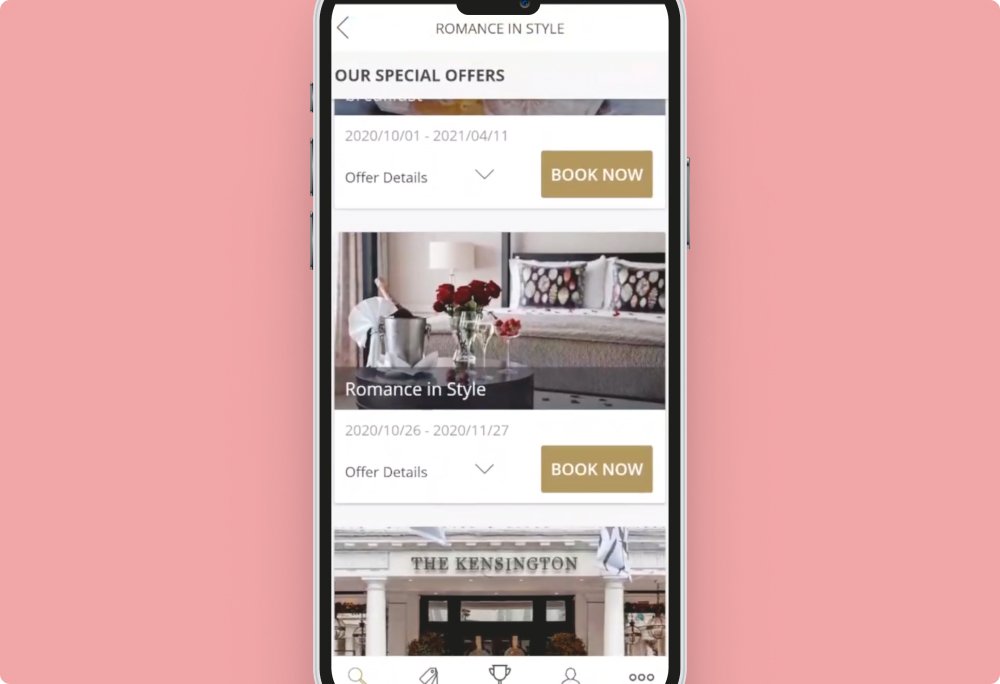
In the Barceló app, when users search by destination, predictive text is limited to hotel names rather than locations, leading to search results that include irrelevant geographical areas.

Search Results
In the Barceló app, users find the volume of search results overwhelming, with irrelevant options appearing alongside their intended destination. Furthermore, they struggle to determine whether the results are located within a specific area of the searched destination.

Date Selection
In the Doyle Collection app, the first user notices that the arrival and departure dates are incorrect due to the use of separate calendars for check-in and check-out. The second user recognises early on that two separate calendars are used but is surprised that a single, unified calendar is not implemented.
Add-ons
In the Doyle Collection app, users feel compelled to add supplementary services to their stay, as there appears to be no clear option to skip this step and proceed directly to the checkout process.

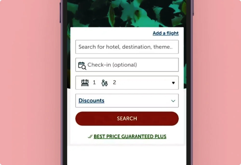
Currency
In both the Barceló and Doyle Collection apps, users notice that the default currency is set to British Pounds, even though they primarily use Euros.
Guest Selection
In the Barceló app, users are uncertain whether the guest selection icon represents adults and children or two adults.
03 Pre-design
Uncovering Opportunities through organising research observations
Collaborating with a fellow student, we documented all research observations on post-it notes in Miro, capturing both the positive and negative user experiences. We then organised and categorised the post-its from the various apps into groups and sub-groups to inform the development of the new app.


Focussing on the various stages of the booking process, I was able to compile a customer journey map based on users’ perceived goals, behaviours, and mental models. This helped identify positive interactions, pain points, and opportunities to develop an improved user experience.
The development of both the Affinity Diagram and Customer Journey Map facilitated the creation of a flow diagram, which served as a blueprint for designing a logical user flow to address the pain points identified in the researched apps.

04 Interaction design
Sketching wireframes for the design of the new booking application

The user research and organization of observations provided a solid foundation for beginning the design process of my hotel booking app. Leveraging the Flow Diagram, I sketched various screen states by hand, creating wireframes that served as the basis for designing the first prototype in Figma.
I was finally able to visualise the User Interface of my new app, incorporating solutions to address the issues identified in the researched apps. My goal was to address the previously identified issues early on in the booking process, ensuring that destination-, date-, guest selection as well as filtering options and map views were easily accessible to the user and that add.
06 Prototyping
Transitioning from Wireframes to a Medium-fidelity Prototype
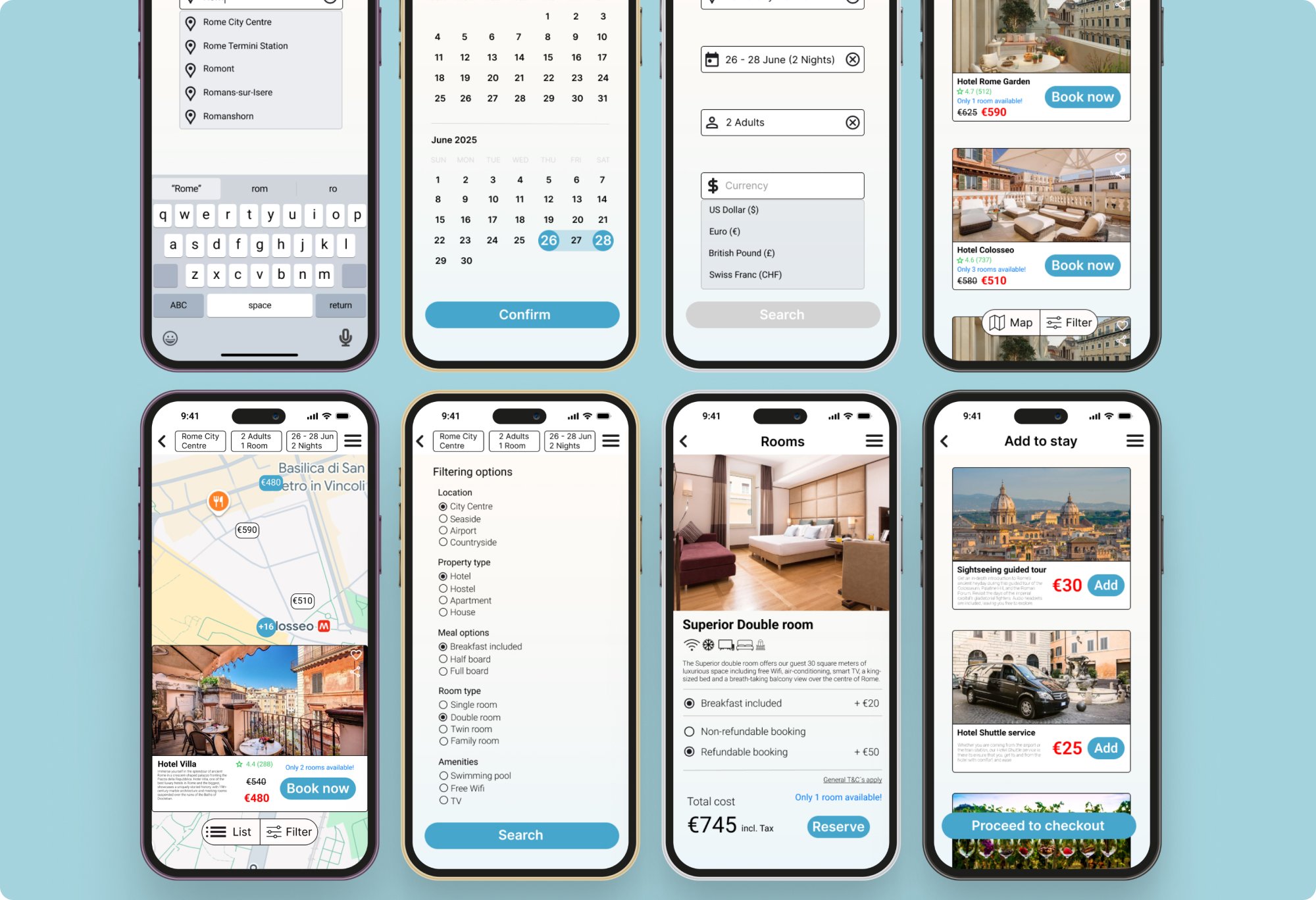
My initial experience with Figma involved transforming my wireframe sketches into a low- to mid-fidelity prototype. Since the course focused on the UX process rather than UI, high-fidelity design was not required. I opted to create a mid-fidelity prototype to familiarise myself with Figma’s features early on, preparing for my upcoming UI Design course in January 2025.
To represent the various screen states in a functional prototype, I established interactive connections between buttons and dropdown menus. The destination, date, and guest selection tabs were positioned at the top of the screen to enable users to navigate back and make necessary adjustments seamlessly. Additionally, I implemented a floating action button at the bottom of the screen, providing quick access to the map and filter views for enhanced usability.

07 Annotation
Annotating prototype screen states for developer handover and collaboration

For my final project, I annotated all screen states of my prototype to provide the developer with a clear understanding of its functionality. I detailed the purpose and behaviour of all buttons, drop-downs, input fields, and checkboxes, as well as outlined error messages triggered by incorrect inputs.
The feedback I received on this project emphasised the importance of addressing edge cases more thoroughly, which I have taken on board for future improvements.